Fitbit Alta HR review: fitness tracker vs. smart watch comparison

fitbit

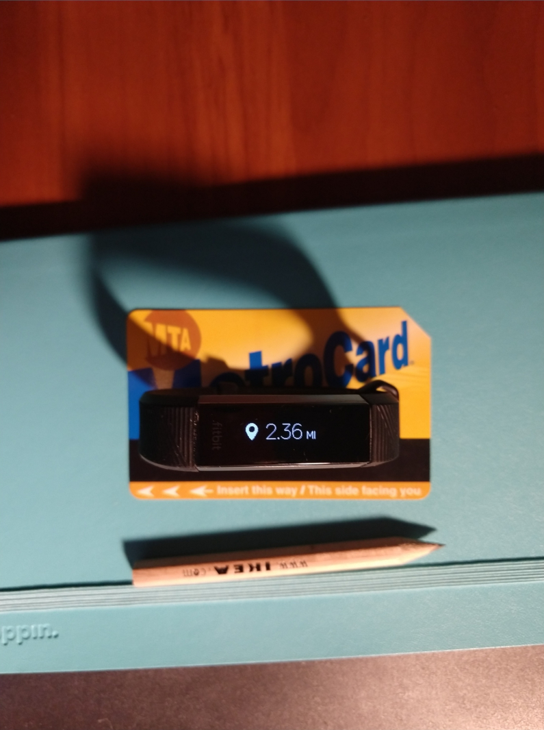
15,000 steps. My fitbit’s vibrating to let me know I’ve achieved another milestone. Another vanity badge that I can parade around like a young boy scout. And you know what? It’s working. I want to see what the next milestone looks like. The next virtual badge to add to my collection of digital swag. Once you get sucked into achievement hunting, you begin to understand the magic of fitbit.

I’ve been using a fitbit Alta HR for a month to see what it’s like to use a dedicated fitness tracker over a smart watch. And it’s been a pleasant, if not bifurcated, experience.

One thing is for certain, a fitbit is not going to replace a smart watch. It is leagues behind a smart watch when it comes to basic functions. The notifications on the Alta HR are limited to texts with no notification shade to aggregate them. You’re stuck with several non-customizable pre-programmed watch faces. Don’t like it? Too bad.

And don’t bother trying to use your fitbit like some weird James Bond device. It won’t be a calculator, a remote for your phone, you can’t respond back to messages on it, you can’t get weather updates on it, and it won’t do searches.

It’s just here to do one thing, and one thing well: track your health. And it nails it out of the park.

One thing the fitbit Alta HR has over a smart watch like my Moto 360 Sport is automatic activity tracking. The fitbit will notice if you’ve been active for a brief amount of time and start logging your workout session. From a mundane walk to work to a full marathon, fitbit will log your heartrate, time spent exercising, calories burned, and more without human input.

Want to manually track your workout? If you have it paired with a smart phone (which you most likely do), you can start a workout session and get even more details, like a GPS map, map elevation information, and more.

To be fair to the Moto 360 Sport, it did automatically track you when you were moving. Plus the tracking on the Moto 360 Sport seemed more or less in line with what the fitbit was saying, so the sensors on the two devices will get you nice ballparks. But it didn’t have the ability to track your vitals unless you manually tracked a workout either through the built-in Moto Sport app or Google Fit.

Which brings up another thing a fitbit will do without asking: be your coach and motivator. Although I got notifications from the Moto 360 Sport when I would reach a milestone, it wasn’t nearly as in-depth as fitbit’s milestones and badges. It tracks daily steps and lifetime distances in addition to the daily active time goals. Fitbit will send alerts not only when you hit these milestones, but also will give you a summary of how you’ve been doing in either weekly or monthly reports.

And if having a digital coach isn’t enough to motivate you, then look to fitbit’s other options. They built up a sort of social media platform, where anyone with a fitbit account can sign up and find their friends that also bought fitbits. From that point, users can compare their friends’ stats with their own, and cheer or challenge them to keep them motivated.

A bit of a loner? No problem there. Fitbit has you covered. It has built-in challenges with solo adventuring in mind. If you wanted to make a day trip out of hiking at a national park or travelling through a city, you can see if there’s a solo adventure that you can track to get another achievement.

The Alta HR also will track your sleep, though be warned, it doesn’t give accurate results unless you’ve slept longer than three hours. It’ll keep track of your resting heartrate and give a ranking to let you know your progress. Plus you can log your food intake, weight, and the amount of water you drink.

Part of fitbit’s strength is having a comprehensive app available for Android, iOS, and Windows 10. They’re all polished, and unlike an Apple Watch or Android Wear, they can be used across all platforms without any restrictions or incompatibility.

The battery life is phenomenal on the Alta HR. They suggest seven days, and I believe it. After using an Android Wear device where I was lucky to get two days, this seems like a blessing.

If you’re looking to get a fitness tracker, this is the pinnacle of what you can expect. It’s light, water resistant, has a great battery life, works across all devices, and just works as intended.

But it’s not going to replace a smart watch. If you want a smart watch, go get one. Also keep in mind that once in the fitbit world, it’s difficult to take your data and migrate it to another platform. Fitbit built up a walled garden, and they don’t want anyone climbing the walls anytime soon.

MacBook Pro 2018 review: Controversy meets conformity

Macbook Open

Apple has been tinkering with their MacBook as of late to usher them into the modern era. But even with all of the changes, Apple kept to a conservative design philosophy that shouldn’t shock most people, save for a very vocal minority.

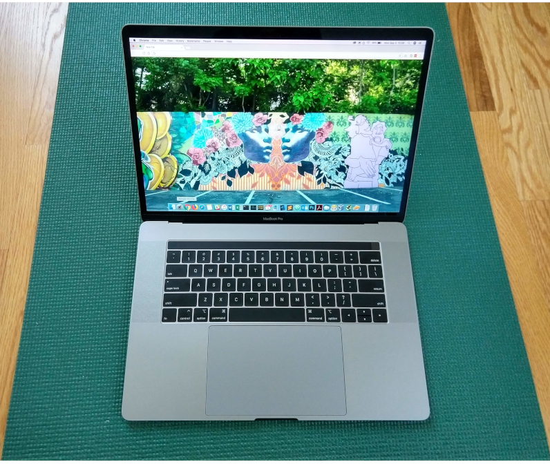
I got the chance to use a 2018 MacBook Pro as a daily driver. It’s the 15.4 inch version with a 2880 by 1800 pixel display, an Intel UHD 630 GPU, a 2.9 GHz core i9 processor, and 16 gigs of RAM. It’s currently running High Sierra 10.13.6.

It weighs roughly four lbs., and feels comfortable to carry around in one hand or use on a lap. The high resolution screen makes sure everything is crisp and in focus.

On the surface, it looks like another run of the mill MacBook. But once you start playing around with it, you realize that there are some controversial changes.

The biggest one, in my opinion, is the keyboard. Apple chose to use the butterfly keyboard setup first pioneered on the MacBook 12-inch model. You know, the “I’m not a MacBook Air, but I’m totally a MacBook Air” replacement.

The keyboard just feels weird. But I will agree, it takes some getting used to. The key travel is too shallow, and it just doesn’t feel right if you’ve been typing on chiclet and mechanical keyboards your entire life.

It’s a design choice that only shaves off a millimeter of thickness. You have to wonder what Apple’s endgame is when it comes to practicality. The keyboards have had reports of dying due to dust getting in them, which Apple corrected by using membranes to keep out the dust. That’s a sign that they’re making too many compromises just for the sake of aesthetics.

The touchpad also borrows from the 12-inch MacBook. It’s comically huge, and feels very responsive. It also has the force touch ability, where a hard press on something like a word will make Mac OS do a dictionary lookup, among other things. This does get rather annoying after a while, but once you train yourself to anticipate it, you won’t accidentally trigger it.

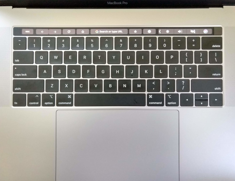
Macbook Touchbar

The other big change is the inclusion of the touch bar. A weird gimmick designed to shut up those that want a touchscreen on a MacBook, the touch bar has received a lot of negative praise.

The touch bar is adaptive, and responds to any apps compatible with it. It replaces the function key row, which you can summon by holding the fn key. It also does auto correct suggestions if you’re typing, and brings up advance features like a scrubber on video editors.

I personally don’t see it as a bad thing. Not once did it get in my way. It always felt like an option, which is great, because more interface choices is better for consumers.

But I do think Apple should just bite the bullet and adopt a touchscreen for Mac OS. They have iPhones and iPads with touchscreens. Windows laptops have had touch screens for the longest time, and I much prefer a laptop with a touchscreen nowadays. Apple might be delaying adding one on a MacBook because they don’t want to cut into their iPad sales, which seems to be coming closer to being the MacBook’s successor in a decade.

Finally, we have the inclusion of four USB-C ports, with the exclusion of any USB-A ports. This is perhaps the one thing that has gotten the loudest criticism from the tech crowd, especially video editors. Truth be told, USB-C still is in pioneer territory, and trying to get current equipment to work with it usually means dongle heaven.

But I think adopting USB-C is a good thing. The only way it’ll receive more support is if more OEMs start switching over. This is the one feature that I’ll say Apple has had the courage to do.

But it was done aggressively on Apple’s part. My current daily driver, an HP Spectre x360, has two USB-C ports, and one USB-A. Plus it has an HDMI port and an SD card reader. The HP Spectre isn’t alone in giving users an option of both the old and the new.

Getting the new MacBook means revamping your accessories to make it work with your new laptop. And that means dongles. Of course, the smarter solution is to get a hub for it, but that’s only going to be useful if you have a desktop setup. If you’re on the go and need your MacBook to work with your equipment, you might find yourself making a lot of compromises.

I’m not affected by this, since my work requires just a laptop to do properly. But I understand the frustration video editors and others that use their MacBooks as a hub for their other equipment must be feeling.

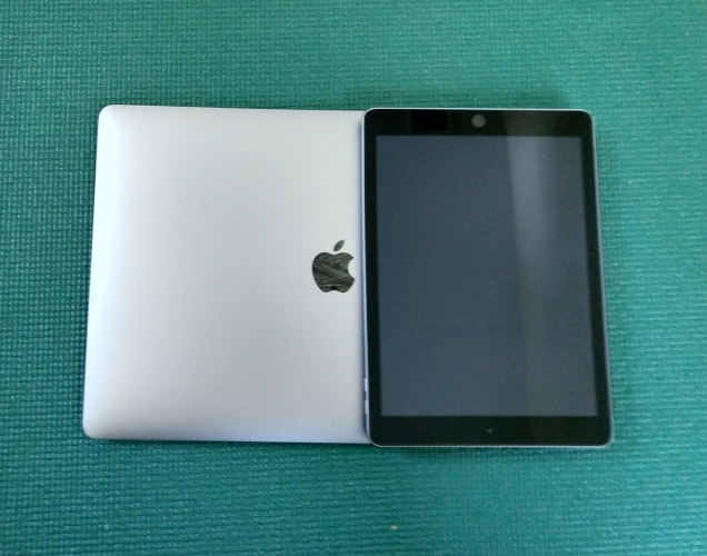
Macbook Close

Overall, I think the new MacBooks have been receiving more hate than they deserve. Truth be told, it’s going to be perfectly serviceable for the average Starbucks dweller using it to compose their blog and sign into Facebook. The battery life is great (I’m getting around 6 to 8 hours), it’s not too heavy, and frankly people like having a MacBook as a status symbol. That branding mindshare is something that even the higher end Windows laptops don’t have.

But the criticism from the vocal minority has some weight. Donglegate is a thing. The touch bar screams meeting half-way and not pleasing anyone. And the keyboard was changed only for the sake of looks, not functionality.

If you’re an Apple loyalist, then you won’t be disappointed. If you need to use a MacBook for work related reasons, and you’re on the fence, be prepared to make changes to work with this machine. If you’re willing to adapt to it, you’ll learn to love it. If you feel the changes are too radical, then you might want to pick up a 2015 MacBook while you can. Or maybe find a Windows laptop that meets your expectations.


Google Home Mini review: Hey, Google Home, what is your purpose?

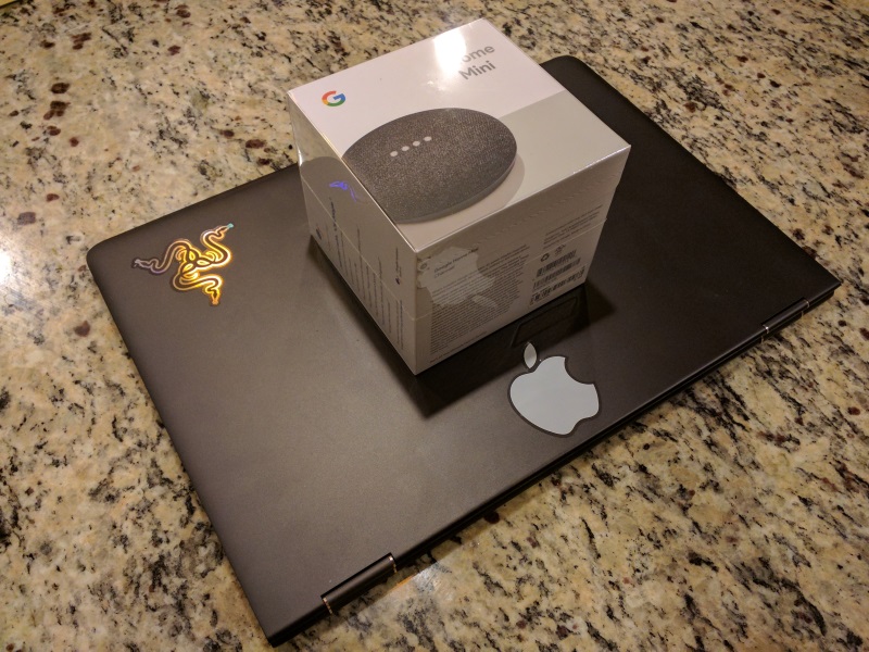
google_home_resize

Everyone in the tech community is hyping smart home speakers as the next big thing. I don’t get it.

Don’t get me wrong, the server based tech behind it is impressive. But in the end, they seem to be nothing more than novelties that don’t add any real benefit except to show how “21st century” our lives have become.

At their current price range, I get why they’re taking off. Both Amazon and Google have smart home speakers selling for $30 USD. They make a perfect stocking stuffer this holiday season.

I decided to buy a Google Home Mini to see what the hype was about. The main reasons are because I’m already knee deep in Google services, and the Google Home Mini integrates perfectly with my Chromecast.

Setting it up was fairly easy. Users are directed to the Google Home app on iOS or Android and walked through some basic steps, including training it to your voice.

This brought up my first annoyance with the Home Mini: You have to tweak its settings using the Home app. There isn’t a web page or corresponding app for Windows or Mac. Although this will be a minor inconvenience for some, I really wish Google would provide its services across all devices instead of turtling in the mobile world. I don’t see them doing this any time soon in the current tech climate.

Once users set it up with compatible apps, their Google Home Mini is ready to receive commands. I plugged it into my Pandora and Netflix accounts, and it worked as excpected. The cool part is using it with a paired Chromecast to show Youtube videos, Netflix videos, or photos from your Google Photos album. Users can stop, pause, and play a new video with easy voice commands.

Another neat feature is having Google Home Mini read the news for you, turning it into an on-demand radio. I imagine it probably can do the same with podcasts, but I have yet to set it up to do that.

But what’s the point?

The main problem is that the Google Home Mini just does things that any user can do with a smartphone or laptop. Sometimes using a device is quicker, since Google Home Mini sometimes either can’t understand what you’re saying, or doesn’t have the capacity to execute a specific command.

The main rub is that it still feels like you’re talking to a computer. And people don’t like talking to a computer. It’s the reason why there still is a stigma when you see someone talking to Siri or Cortana in the open.

The speaker’s voice sounds natural enough, but within an uncanny valley. The voice detection is fast, but using the keyword to activate it still feels awkward. And the demographic I feel this is supposed to help the most, baby-boomers and older, really don’t get the point of talking to it except as a parlor trick.

But there is a point.

Google, Amazon, Apple and Microsoft probably don’t really care that their smart home speakers aren’t where they should be now. These devices are merely gateways to collect data they need for the next generation. And the thing that will improve the next generation is more voice samples. Whichever company gets the most voice samples will have the better algorithm in the end.

Right now it looks like Amazon’s Echo has the lead. They were the first to define this device, letting everyone catch up to them. Google so far looks like they might be the only worthy competitor to the Echo for the time being. Apple delayed releasing their HomePod, which will sell at a premium. And Microsoft’s partnership with Harman Kardon isn’t getting the advertising, marketing or mindshare it deserves.

You’ll most likely be seeing smart home speakers everywhere within a couple of years. And if you’re like me, you probably won’t get it. I see the current generation of smart home speakers becoming the next Nintendo Wiis, gaining a large following due to gimmicky innovations, only to collect dust on a desk.

Android Wear 2.0: Decoupling your smartwatch from your phone

screen2

The next version of Android Wear is a nice upgrade for those that can get it. Whether you can get it or not is a different story.

Android Wear 2.0 has been rolling out to supported devices over the past months. I recently got it on my Moto 360 Sport, and I have little issues with it so far.

Improvements all around

The biggest thing users will notice is the interface got a major overhaul. The Apple-white aesthetic gives way to a familiar old-school Android off-black.

The main screen accesses the watch faces. Normally, you’d have to gesture swipe to the right to access the watch’s apps, but now swiping in any direction will bring up a watch face selector. Users can peg their favorite watch faces to this new menu and switch them on the fly. Pressing down on certain watch faces brings up granular controls for changing the watch color or style.

Apps are now accessed using the watch crown. The apps menu now swipes clockwise from the bottom left, giving a satisfying dial feel when scanning the menu. Android Wear 2.0 added a new keyboard with swipe functions to search and type in apps. Some stock apps got a new coat of paint, including the alarm, contacts, messages, timer, weather, and Google feed.

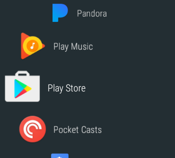
Speaking of apps, users can download Android Wear apps without using a paired Android phone. The inclusion of the Google Play Store is a nice addition, even if the current repository is a bit thin.

screen3

Notifications are much richer now. They’re more unified and easier to interact with compared to the older method.

The settings menu got changed for the better. Before, users had to swipe through several sub-menus in the notification shade. Now the major settings like airplane mode, brightness, and do not disturb mode are on one page. The main settings has more granular control for things like notifications, Google hot word detection, and keyboard.

Performance wise, I haven’t noticed a difference between Android Wear 1.5 and 2.0. The watch hasn’t interfered with my workout routine, and the new timer and stopwatch only help to improve the experience. Battery life seems the same, roughly around two days.

The only issue I’m having so far with the watch is retraining myself to the new user experience. I’m accustomed to swiping to the right to access my Android Wear apps, and clicking the crown takes some getting used to. But this is a minor gripe.

screen1

Android in chains

It sucks to beat a dead horse, but the easiest way to get Android Wear 2.0 is to buy a watch with it preinstalled. Despite Google’s best efforts, getting up-to-date patches is a chore to do on an Android Wear device. Even though Google controls the Android Wear experience and doesn’t allow manufacturers to tinker with its vision, it’s the manufacturers that control when users receive updates.

It’s a shame. Android Wear 2.0 is a nice upgrade. And it’s a step in the right direction for an open-source platform.

Preparing for iOS 11: Using an iPad with a keyboard

keyboard_2

The iPad is a solid device. But to me, it always felt like a toy designed for lighter tasks like Candy Crush and Facebook. That’s soon to change with the launch of iOS 11, which will make it easier for iPads to multitask, including a native file browser.

To truly become a power user on an iPad though, you’ll have to invest in a keyboard. The iPad Pro has its own custom keyboard, but for regular iPads, Bluetooth is the way to go.

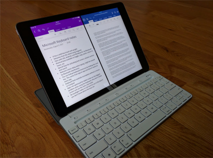
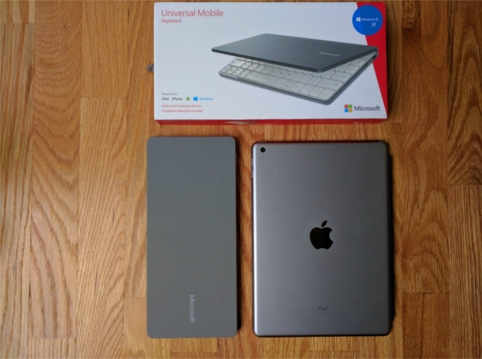
Weirdly enough, one of the better Bluetooth keyboard makers is Microsoft. I picked up Microsoft’s Universal Mobile Keyboard in anticipation of iOS 11, and tested whether an iPad keyboard is a solid investment, or merely a fool’s dream.

The keyboard I’m using is an older version, complete with a folding case that doubles as the stand. Microsoft also makes a foldable version that it sells on its online store.

The keyboard feels solid to use and type on. The keys have a good travel depth and don’t feel clunky or cheap. It connects to its case with magnets, and similar to a Surface keyboard, can be attached and detached with a simple pull.

The keyboard is compatible with Android, iOS, and Windows 8 and above. It can pair with up to three devices, and can swap between the three via a switch in the upper right hand corner.

Several shortcuts work the same way you would expect on Mac OS X or Windows. Holding Cmd + Tab brings up a familiar task switcher, with the last eight apps queued. All of the Cmd combinations work, like Cmd + A to highlight all, Cmd + C to copy, and Cmd + V to paste. And if you get stuck, you can hold down the Cmd button to get a list of available Cmds. Unfortunately, holding the Cmd key in some apps won’t show anything at all.

This is the biggest flaw when using an iPad with a keyboard: Not every app recognizes it. Some apps give you extra control like Safari and the Microsoft Office suite. Meanwhile, apps like Reddit and YouTube just don’t realize that keyboards for iPads are a thing. Nothing works beyond typing in fields.

And that’s for apps with an iPad version. Some apps like Instagram aren’t iPad optimized and refuse to change their screen orientation from portrait to landscape. Not only do you get a lower resolution app, but one that is unusable with a keyboard.

Then there is the other major factor: no touchpad or mouse support. True, anyone can touch the screen to negate this. But it feels incomplete as a power user not to have a touchpad or mouse. Luckily, this isn’t a game breaking feature, but Apple should address it sooner than later.

Aside from that, I noticed a slight delay affecting my typing every so often that I only could imagine as interference from my smartwatch, due to it having its Bluetooth on.

keyboard_1

After using this for a couple of days, including writing this blog entry on Microsoft Word, I feel that getting a keyboard for an iPad isn’t as silly as it seems. It makes an iPad a great backup device in case your laptop or desktop breaks down. Or it might make a handy daily driver, ready to take care of your office and productivity needs. Or maybe you don’t feel like lugging around a laptop on a long journey.

As for me, I’ll definitely be sticking with my laptop for the near future. The iPad isn’t there yet when it comes to higher level productivity like software development, photoshop, and video editing. Yes, software exists for this, but the experience is dwarfed by what you’ll get on a Mac or PC. Let’s see if iOS 11 changes this.

iPad 2017 review: Premium in an affordable package

iPadTwo

Who is the iPad for? That question is hard to answer. But one thing is for certain: the iPad is a great device that can fill in the gaps a laptop and smartphone can’t cover.

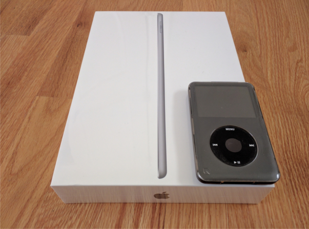
I spent a week with Apple’s new entry level iPad refresh for 2017. This is the first Apple device I bought for myself since my OG iPod Classic from 2007.

Even though it’s an entry level device, it’s gorgeous. The iPad’s hi-resolution screen displays crisp, vibrant images, and the one pound chassis feels both light and sturdy. Apple fans know the drill.

Setting up Touch ID took a few minutes, but it was worth it. It always works. I only wished my HP Spectre x360’s Windows Hello Facial Recognition worked this efficiently.

The iPad’s battery life is incredible. Its battery went from 89-percent to 25-percent within the first day of using it. Most of my activity during this period included web-surfing, watching videos, and communicating with friends and loved ones. The sound is rich for such a petite device, even though the stereo speakers are located at the bottom of the iPad.

And its performance is nothing short of phenomenal for a $330 USD device. I don’t remember the iPad stuttering or freezing while using it. Plus it has a headphone jack. Who can complain about that?

iOS 10 again

Using the iPad also meant familiarizing myself with iOS again to anticipate its nuances and quirks. Aside from using a friend’s iPhone or helping someone with minor settings, I haven’t formally used iOS on a serious level.

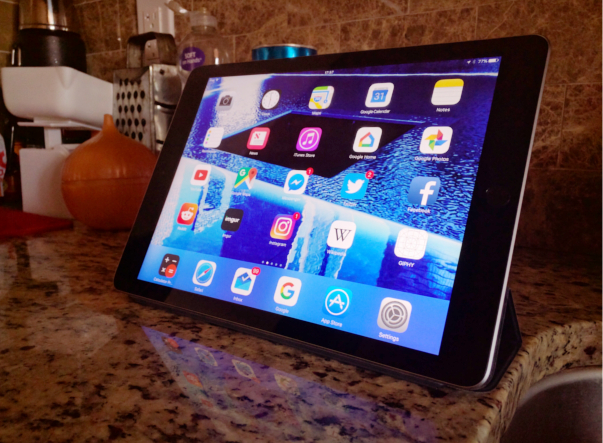
The 2017 iPad comes with iOS 10, and I’m happy to see that it’s made huge improvements over what I remember last. I love the new widgets on iOS’s lockscreen. They work similar to the live-tiles on Windows 8 and 10, giving information at a glance while keeping the aesthetics intact. They’re not as powerful as Android’s widgets, but they’re just more pleasant to use.

The notification shade works like its Android and Windows Phone counterparts. Swiping up from the bottom brings up an action center with shortcuts for brightness, night-mode and Bluetooth. A quick swipe down in the screen’s body will trigger spotlight, which works as great in iOS as it does on MacOS. Android doesn’t have anything similar to spotlight, even though it has much tighter Google Search integration.

The split screen mode in iOS works way better than the Android implementation on Marshmallow. The split screen emulates the look and feel of its MacOS counterpart, with the ability to swap in compatible apps in a tray. The split screen isn’t as powerful as the Windows 10 implementation, but it’s great to use nonetheless.

Plus there are some great touch gestures on the iPad, including multi finger swipes to open the multitask window and go back to the home screen.

And the home screen is where my love for iOS turns back to mere lust. I know the saying goes that if it ain’t broken, then don’t fix it, but iOS’s home screen leaves a lot to be desired. It’s just a row of icons. Sure, you can rearrange them, remove them, and place icons inside of each other to create folders. But it is in serious need of an organized tray like what’s in Android and Windows 10. I feel disorganized when looking at the iPad’s home screen. I know it’s a style choice that millions have little issues over, but it does bother me, and I’m certain it bothers others.

And then there’s the keyboard. This isn’t as big of an issue since Apple allows third party keyboards. But the Apple Keyboard sure likes to force its way back even when it’s no longer the default. It made some improvements with predictive text, but it still feels a generation behind Google’s and Microsoft’s keyboards, especially with a lack of swipe and no emoji prediction. In spite of it, I got used to the stock keyboard.

This is another minor gripe: the universal settings. I’m used to the way Windows and Android works, where the app settings are contained in the program you’re using. The settings do work well, though, once you get past the fact that you have to check this highly centralized location and scroll through a list of directories before finding the app you want to tweak.

iPadThree

First Class Software

Needless to say, the app experience on iOS is pleasant. There are a few exceptions on the iPad, though, due to the apps not scaling properly on a larger display. Instagram comes to mind. The weird thing is the Windows 10 Instagram app scales beautifully, so I imagine they’re going to make an iPad version soon enough.

Some of the stock apps that came with the iPad are a treat to use. The News app is great. Apple’s design philosophy works well with a print format. The camera is super responsive, though it could use more pro-features to take advantage of non-optimal light situations. Don’t take pictures on an iPad though, unless you have to.

And Safari surprisingly wasn’t completely terrible to use. It even supports extensions, something Chrome mobile for Android doesn’t do. A native Ad-Block Plus extension without rooting or weird tricks? Yes, please.

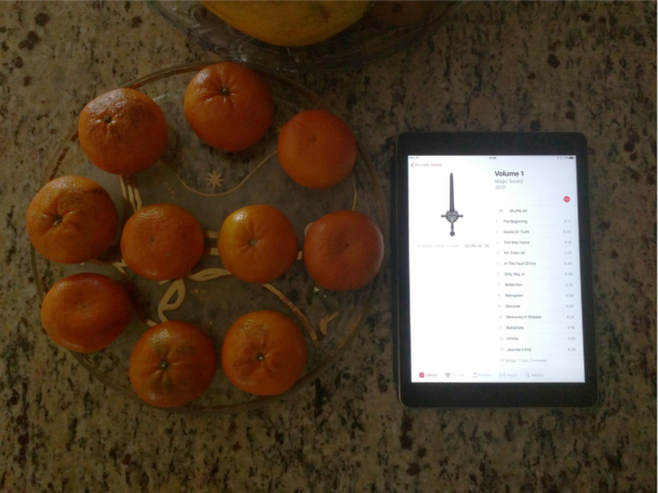
Of course, not everything was perfect. I synced the iPad with iTunes, and it destroyed my music’s metadata. I’ll have to rely on third party support for my music for the time being.

The stock photos app could use a bit more polish. It doesn’t show photos in reverse chronological order, and there doesn’t appear to be a way to change it. Plus it could really use the ability to look at photos on the cloud, like on Dropbox or Google Drive or OneDrive.

And for some reason, the iPad didn’t include some basic apps, including calculator, weather, and stocks. Luckily there are great third party alternatives to replace them that scale well on an iPad’s screen.

But the weirdest things were the quirky behaviors iOS did every once in a while. For some reason, I had to sign back into my Apple account several times, even though I made sure I was logged in. And I encountered a weird bug that made my iPad logged off the wifi every once in a while it was on a guest network. My Android phone didn’t have any issues with the guest network’s wifi, though.

iPadOne

Jack of all trades

The iPad is in a weird spot. The tablet market has plateaued, much like the desktop market. Now you have smartphones getting bigger, and laptops incorporating features tablets used to claim, like touch screens and portability. Tablets seem irrelevant in the grand scheme of things.

But after using the iPad, I get why this device sold so well. And I see why Apple fans have a hard time giving up their iDevices. Cupertino spent a lot of time crafting the look and feel of this device to the point that you have to hold and use it for a bit to just get it.

The iPad now occupies the third spot in my unholy trinity of smart devices, next to my laptop and smartphone. It can’t replace my laptop, which I need for work related reasons. And it can’t replace my smartphone. But what it does well is cover the weaknesses of one device over the other based on use case.

The iPad is far better for casual use than my smartphone is. And when I don’t need to do serious work, but need to have a larger screen on me to demonstrate or review something, the iPad’s lighter footprint, phenomenal battery, and ease of use makes it better to carry around than my laptop.

If you don’t need to do extensive photoshopping, video-editing, programming, server hosting, or triple-A gaming, then using an iPad as a daily driver seems like a reasonable choice. I know I’m going to continue using mine.

HP Spectre x360 15 2017 edition review: Leaves me in high spirits

Spectre1

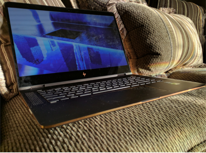
The HP Spectre x360 15-inch 2017 model is a gorgeous device. It ticks all the check boxes I’m looking for in a laptop while sporting a premium coat of paint. And if you’re considering buying one, you should stop reading and get one right now. But if you’re on the fence, continue reading.

My previous laptop, a Lenovo Ideapad from 2012, broke its hinge for the second time to the point of no return. I decided to replace it with the HP Spectre due to it having similar specifications to the Ideapad.

An important feature for me is having a 15-inch screen, since I don’t own a desktop workstation and find 15 inches a great size between viewing and portability.

From old to new

The Spectre has a 512 GB SSD like my Ideapad, but comes with 16 GB of RAM, a 3840 by 2160 IPS touch display, and a dedicated 940mx dGPU. The Ideapad has 8 GB of RAM, a 1366 by 768 non-touch TN panel display, and an Intel integrated HD 4000 GPU.

The screen on the Spectre is gorgeous compared to the Ideapad. The higher 4k resolution makes text crisp, and the viewing angles are better than the TN panel.

Unfortunately, it comes with a major caveat: not every Windows programs support hi-dpi scaling. I’m having trouble with GIMP and VLC at the moment, and the workarounds to fix the tiny screens are a bit of a chore. Some other programs have blurry text, but I’m willing to deal with that as long as the user interface is accessible.

The Spectre is lighter compared to the Ideapad, at 4.42 pounds (2 kg) versus 5.84 pounds (2.65 kg). I didn’t have any issues carrying the Ideapad around, so the Spectre feels great to move one or two-handed. But I’m aware that you might consider the Spectre heavy if you’re used to carrying around something the size of a MacBook Air.

The Spectre’s battery blows my Ideapad out of the water. The Ideapad couldn’t go past 3 hours at best, making the power cord mandatory. I tested using the Spectre for a day doing web surfing and Youtube watching, and got a decent 8 hours out of it. It makes me confident taking it to any conferences or meetings and not having it die on me.

The two front facing Bang & Olufsen speakers sound pretty good on the Spectre. Invest in a good pair of headphones, though. The chiclet keyboard is very comparable to the Ideapad. Lenovo has a reputation for good laptop keyboards, and the HP Spectre’s keyboard feels identical.

Software wise, the Spectre doesn’t feel any different than the Ideapad. Part of that is because they’re both running Windows 10, which has done a great job of streamlining the experience from one machine to the next.

The Spectre comes with a bunch of bloatware, including Netflix, McAfee, and HP proprietary software. This stuff is removable, and if you want to be thorough, you can clean install Windows 10. I kept Netflix. Who wouldn’t at this point?

The Spectre has a big glass touchpad, around the size of the new Macbook Pros. It’s a bit awkward to get used to right-clicking it, but not a major issue. The touchpad is responsive and recognizes the new Windows 10 gestures and I have little issues with it aside from the size.

Spectre2

The convertible experience

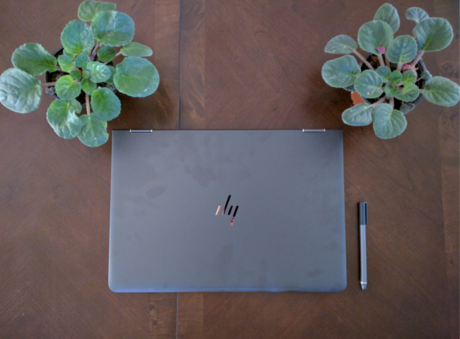
The main selling point is the Spectre’s 360 degree hinge, allowing it to rotate for presentations or as a tablet. It’s pretty cool, but nine times out of ten, you’re going to use it as a laptop. Holding it as a tablet in one hand is a bit awkward, and I wouldn’t recommend doing that for extended periods of time. Laying it on a table or in your lap in tablet mode however is very useful for casual mode, or if using it with the included pen.

The pen works OK. It has two buttons that users can change with the included onboard software. It’s not quite a mouse replacement, but geared towards artists and business users needing to take notes.

Using the touchscreen is great. It feels natural, even in laptop mode. Steve Jobs was wrong about this. Chances are those complaining about touching their laptop screens have smartphones or tablets, and are missing the point. It’s an option. Users are never forced to use the touchscreen, but having it there makes scrolling and pinch to zoom a lot more natural for some users.

Microsoft Edge feels best when using the touchscreen, but Google Chrome isn’t too bad either. It has some resizing issues when dragging with your fingers, but the other functions work as expected. Firefox, on the other hand, needs a lot of work before I could recommend using it with a touchscreen on Windows.

Spectre3

Minor issues

I did run into a few issues, though. For one, the fan kicks in a lot. It wouldn’t be that big of a deal, but the fan is very noticeable at between 20-30 dB when running at full power. It seems a few un-optimized rogue programs were causing the fan to turn on, but deleting them has brought it back to acceptable levels.

Also, if you need more ports, then you might want to reconsider another machine. The Spectre comes with a USB 3.0, two USB-C (one of which supports Thunderbolt 3), an HDMI output, and a full-size SD card. If you need more USB 3.0 ports, you might want to look elsewhere. USB-C is the future, though, so the Spectre is a bit futureproof.

And as I mentioned before, dpi-scaling is a major issue on the Spectre. That’s something developers are going to have to fix. But it’s getting more noticeable as devices trend towards 4k and 8k displays.

Overall, these deficits don’t outweigh the pluses you’ll gain from the HP Spectre. It has a gorgeous black and gold finish, a solid keyboard, a great looking display, excellent battery life, isn’t too heavy, and can be used in both tablet and laptop modes. At $1,499 USD for the version I own, it hits a sweet spot of not too many compromises. If you find the price too expensive, you can downgrade the RAM and SSD to 8 GB and 256 GB each, or upgrade to a 1 TB SSD model. All versions come with a 4k display, pen, and leather carrying slip. This one’s a keeper.

Macs vs. PCs: They’re not that different, after all

Long have I been a Windows desktop user. In spite of some major shortcomings, Microsoft managed to make major improvements to its operating system that kept me from switching to a Mac.

But I’m willing to keep an open mind. Recently, I’ve been using a Macbook Air for work. And I can see why people like them so much.

So how does OS X El Capitan (now MacOS) compare to Windows 10? Surprisingly, they’re more similar than they are different.

What’s similar

The first thing I noticed is that both MacOS and Windows 10 have easy to use interfaces for finding stuff. Apple uses the Finder/spotlight function, while Windows uses the search/Cortana function. Apple’s solution seems a bit more integrated than search on Windows from my experience.

For example, spotlight seems a bit quicker and returns more relevant results from either the desktop or online resources like Wikipedia. Search will default to Bing a lot, which isn’t bad, but could use a bit of improvement.

They both have an integrated notification shade hidden on the right hand side. Windows 10 calls this the Action Center. MacOS not only collects your notifications, but also has the iOS widgets like calendar and stocks. Windows 10 has these located in Cortana in the search function.

They also have virtual desktops. But MacOS handles it much better than in Windows 10. Making an app fullscreen will automatically create a virtual desktop. Users can switch between them using a three finger gesture on the Macbook touchpad, or dismiss the virtual desktop by minimizing the app window.

Windows 10’s virtual desktop is more manual. You have to drag your apps into a new virtual desktop. Switching between them requires either using a three-finger gesture on your touchpad (if your Windows laptop supports it) or pressing Windows Key + Tab to show the virtual desktop menu. Long time Windows users probably will find it easier to Alt + Tab between apps and forego using the virtual desktop altogether.

But one thing they share in common that Windows gets right is the split-screen function. Microsoft calls this snapping, and it’s super easy to use. Just grab your app with a mouse or the touchpad, and drag it to whatever corner you want. Microsoft made this easier in Windows 10 with the inclusion of multiple sizes for snapping as well as using the Windows Key + arrow keys to snap via the keyboard.

This is an opaque thing to do on MacOS. Users have to open the app and look for the green button in the upper left hand corner, then hold it for the snap function to take place. MacOS only supports dual-screen split-screen at the moment, and worst yet, it only supports split-screen for select apps. You can split-screen any app on Windows 10, making the Mac implementation feel like a major step backwards.

What’s different

Honestly, not a lot is different between the two operating systems, and chances are these distinctions will get fuzzier as time marches on.

For one, Windows 10 has the start menu, which received a lot of controversy due to its removal from Windows 8. It’s not that big of a feature, though. All a user needs to do in Windows 8 and Windows 10 is press the Windows Key and start typing to search. This is how a user navigates around MacOS, and it works just fine.

MacOS has a Launchpad that honestly reminds me of Apple’s take on Windows 8 fullscreen start replacement. The major difference is Launchpad is modelled after iOS. Again, a regular user never needs to touch this at all.

The starkest difference is mostly hardware related. There’s no denying this: Apple touchpads just work better than Windows variants. But that’s not to say that Windows touchpads suck. Some do, but not all.

However, the touchpad is always guaranteed to be good on a Macbook. All the gestures work and don’t require adjustments out of the box. Whereas users don’t know what to expect with a Windows touchpad.

The touchpad on my Lenovo Ideapad works great, but is missing some handy gestures like virtual desktops. Other Windows touchpads either aren’t responsive, or have custom gestures based on the manufacturer’s needs. If you need a solid touchpad, stick with Apple.

And the software side tends to be a mixed bag. Best case scenario is a user is going to spend most of their time on the browser, so both systems got you covered. The desktop apps’ quality depend on the developers. Some tend to be more polished on MacOS, some are more polished on Windows. I’m a big Office user, and can’t stand using the Microsoft suite on Macs. But that’s Microsoft’s fault more than anything.

Gaming companies tend to favor Windows, but that’s not a deal-breaker if you need a desktop for work alone. Microsoft managed to address software concerns that developers had by including the Bash terminal in the Windows 10 anniversary edition. Although it is a work in progress, it allows access to open-source tools without requiring workarounds.

In the end, would I recommend switching? That’s a tough call. I honestly feel that both systems are more alike nowadays than they are different. Apple and Microsoft have been improving their operating systems for over a decade, and know what works and what doesn’t. They both have reached a convergent design philosophy where one company will come up with a feature that the other will unabashedly copy. The community is the biggest benefactor in this arrangement.

The only thing I would recommend is doing research on what you need from your laptop or desktop before buying. For example, if you want a laptop that will last, you probably should consider spending more on a premium model like a Macbook than getting a bargain model PC. If you know you want to game on your desktop, getting a Windows machine probably would make more sense than a Mac. Just realize that the Mac vs. PC arguments mean less nowadays than they did in the past.

As the Rising Sun fades into the sunset, new challengers emerge

I remember that one thing was fairly consistent with electronics products when I was growing up: The good stuff came from Japan.

There was a time during the 80s and 90s where it seemed as if Japan would dominate the electronics scene for eternity. A liquidity bubble crisis and a couple of insular policies later, and the Rising Sun appears to be approaching its twilight.

This is apparent when looking for a new gadget on Amazon or Best Buy. Sony, who seems to be the only big player from Japan that gives a damn, sold its Vaio line in 2013, effectively ending its PC division. Now the new owners are making laptops again, but only for the Japanese market. Sony’s Xperia smartphones are almost impossible to find in North America. Their televisions have given way to competitors from abroad. Their only saving grace, aside from their financial and film sectors, is the PlayStation line, which is earning a decent presence in consumers’ living rooms.

Toshiba still makes laptops for the world’s market, but hasn’t been flexing its marketing muscle to back it. Nor have they been coming up with new and innovative designs to excite the market. NEC, which never targeted North American markets to being with, had to partner with Lenovo to release their lightweight La Vie laptop to the outside world.

And let’s not forget Panasonic, aka Matsushita. How they’re even able to function nowadays is a miracle by consumer standards. Perusing their websites brings up a treasure trove of devices that would have been relevant in the 90s. Their existing contracts with big corporations and government entities must be strong enough to keep them afloat, because the average consumer isn’t looking for cordless landline phones and fax machines.

What happened? There are a lot of reasons could why Japan isn’t the dominant player anymore. The main theme is that globalization caught up to Japan in a way that it probably couldn’t have anticipated.

Japan’s decline started during the beginning of what it called its lost decade, which also became known as the lost decades due to spanning over 10 years. It lasted from the early 1990s to the late 2000s, mostly because of similar financial reasons that caused the Great Recession to happen in the United States and Western Europe in 2008. Money simply wasn’t flowing properly.

At the same time, Japan’s demographics started to change. According to statistics from the CIA World Factbook, the Japanese are collectively getting older. Their birthrate of 1.4 children per women is one of the lowest in the world. Their median age is 46, and their total life expectancy is estimated to be around 84. And their immigration rates are practically non-existent. This is leading to a grayer country that is becoming more interested in conservative policies like taking care of its burgeoning elderly population, rather than expanding its markets.

The new competition

The conservative outlook Japanese firms adopted in the early 2000s coincided with new competition rising from abroad. Samsung, for all intents and purposes, has become the de-facto Sony, making every kind of electronics device they could think of, bar a proper video game console. The South Korean manufacturer originally started out making parts and products for the big players, before transitioning to its current role as one of the most dominant electronics manufacturers in the world.

Samsung isn’t the only company from South Korea to rise in recent years. LG is another strong manufacturer, making traditional electronics like refrigerators and laundry machines, to smartphones and televisions. And it isn’t just South Korea dominating the electronics scene.

Competition from Mainland China and Taiwan have also sprung up as viable competitors during this time. ASUS and MSI are both respectable computer manufacturers based in Taiwan. And one need not look any further than Lenovo, the Chinese computer giant that dominates the laptop market, even after its kerfuffle with the now infamous Superfish Trojan. Although Lenovo lost a bit of prestige with the Superfish fiasco, it’s still one of the most prolific computer manufacturers today, creating innovative laptops like the Yoga series with 360 degree hinges. Their purchasing Motorola from Google last year for approximately $2.91 billion USD will help them gain a smartphone audience outside of China, much like when they purchased IBM’s personal computing division in 2004.

East, meet West

The competition isn’t coming from East Asia alone. During this time, the United States started getting its act together, coming out with products that would compete on a global level. It was during the 2000s that the world saw Apple rise from its former ashes. Apple created the iPod, iPhone, iPad, and Macbook, which are prominently seen throughout the world. In a role reversal, the iPhone is the dominant smartphone in Japan, at roughly 60-percent of smartphone owners in Dec. 2014, according to Kantar. This is in a country traditionally known for supporting local brands over foreign ones.

Apple isn’t the only resurgent company. Dell, which went through their ups and downs, began to get their acts together and started releasing compelling devices. Dell’s 2015 XPS 13 brand is on top of reviewer’s recommendation lists because of its beautiful craftsmanship, an almost bezel-less screen, and a slim design. Dell also has been working on tablets running Android and Windows that have caught consumer attention, including the Venue line.

Even televisions are no longer East Asian dominated. Vizio, a small Californian based startup, is now one of the most prolific television manufacturers in North America. They’ve expanded to selling televisions in Japan, another role reversal.

At the same time, North Americans desire for Japanese products have not died off. One only would need to look at the automobile industry, one of the few areas Japan unquestioningly dominates to this day. But there’s simply a bigger selection of companies to choose from.

Frankly, I don’t think it’s such a bad thing that Japan has actual competition from reputable companies. But they shouldn’t use this as an excuse to stop innovating and creating products for the world to enjoy. Japan can’t afford to rest on its laurels. Its economy is too dependent on the export of its goods and services to keep it afloat for it to throw in the towel.